Updated 24 January 2017
The following entries summarize my experience conducting my own research and working on different projects in research teams. These studies are not a comprehensive representation of my research background but rather a sampler.
Personas
(Any identifying information about the team, the client, the banks, or the application has been removed).
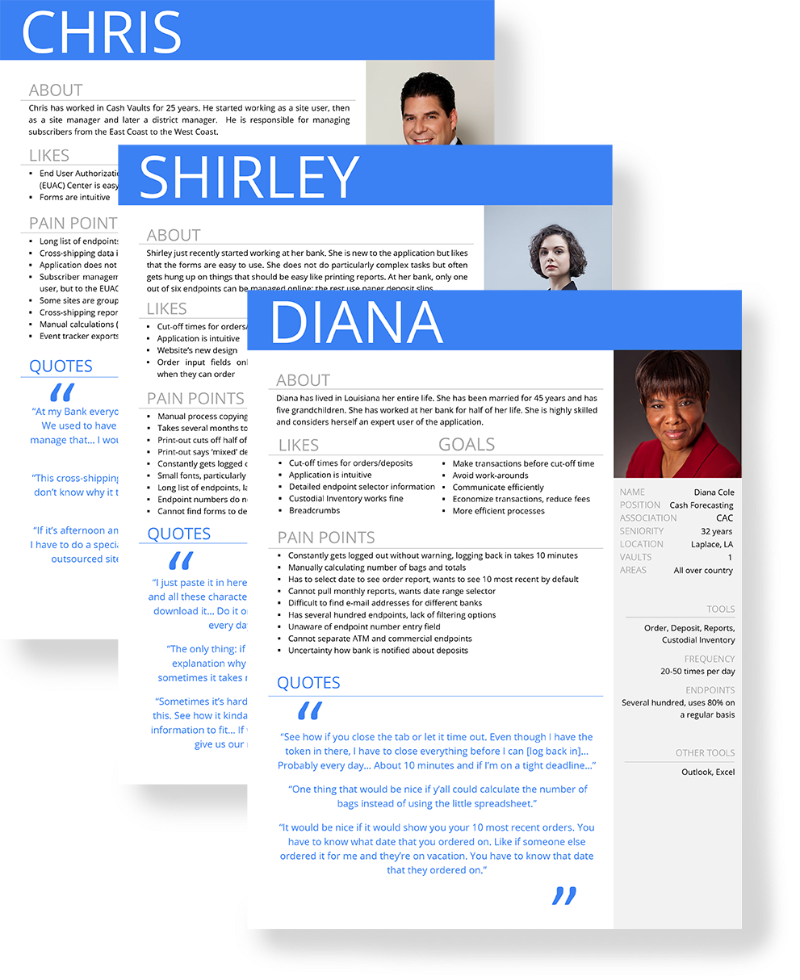
I was a dedicated UX Analyst on a project to develop an application that is used to send millions of dollars in cash within a single transaction starting from sprint zero. A single a transaction can easily be 500 million dollars. So naturally, there is a lot of security involved, but to quote Jared Spool: “If it’s not usable, it’s not secure.” It was mine and the UX team’s mission to shift generic conversations about “the user” toward an understanding of what real-world users’ needs and wants are.
For example, during requirements, there was an assumption that a user would never have more than 10-12 endpoints (like bank branches and ATMs) to select from a list. However, during contextual interviews all of the participants we talked to had long lists—up to several hundred—of endpoints. The lack of filtering options and the fact that endpoints are sorted by endpoint number rather than location presented a real struggle to every participant.
To communicate user needs to the product owners and developers I created the above-presented personas. I knew that a generic template would not be sufficient to communicate the user needs of this particular application. Therefore, I created a “persona bar” to the right side of the template that lists information relevant to this particular application’s user experience such as the number of endpoints, the tools, and the frequency of use. All of the information in the persona was based on contextual interview data. Pain points are supported by relevant participant quotes and numbers such as the approximate time that could be saved with simple changes. I wanted the team to understand that providing filter options could cut a significant amount of time from the user’s process cumulatively.
(Any identifying information about the team, the client, the banks, or the application has been removed).
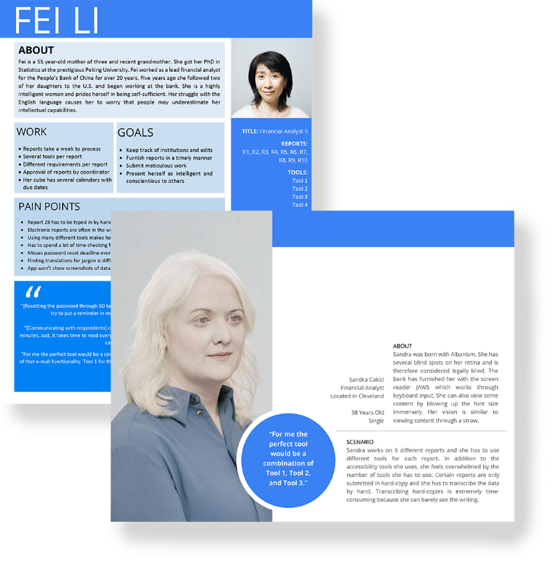
Another project I worked on was the development of a tool for financial analysts. The problem the development team was facing was to consolidate many disparate tools that financial analysts are using into one single tool. Additionally, the new tool had to meet section 508 accessibility requirements.
During hybrid interviews we identified the different reports the participant financial analysts were working on. The actual reports were important because each report would often use four to seven different tools if they are not filed on paper which makes the process even more difficult. An analyst might have to work on three to fifteen different reports. I created the above-presented persona, Fei Li and gave her a persona bar that listed her reports and a long list of tools she may be using for those reports.
Importantly, I gave Fei Li a foreign language background. The development team has a requirement to develop for accessibility. Development teams can feel hesitant to develop for a persona that only represents a small section of the user base. Non-native English speaking personas such as Fei can be leveraged to meet cognitive accessibility requirements. There are various ways to incorporate accessibility issues into a persona from narrating a broken arm for motor impairments to declining vision in an older persona for vision requirements. However, the application also had to be screen reader accessible which is why I created a scenario-based persona. The persona named Sandra was born with albinism and requires a screen reader to furnish her reports. Being aware of the additional need for accessibility tools in addition to the many financial analyst tools represents a challenge for the development team.
(Any identifying information about the team, the client, the banks, or the application has been removed).
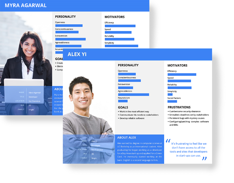
Shortly, after we sent Fei off to the financial analyst team, DevOps contacted us and asked for me to create two personas representing developers. We explained that we usually base our personas on the data we collect during user research, but we had not conducted any research for DevOps. We agreed that I would create personas based on demographic and statistical data I could find on the intranet. Since we did not have a lot of data, I opted for a more visual approach and chose to emphasize the demographic and personality factors of the personas.
Journey Maps
(Any identifying information about the team, the client, the banks, or the application has been removed).
To continue the story of the cash application with the users who have many more endpoints than expected: when we presented our findings, the product owner was confused as to why the bank’s administrator would allow a user to see so many endpoints. Why did the admin user not prune the endpoint selector list to only include the few endpoints users were actually responsible for?
We found out why when we interviewed the district manager of a bank. He told us that when he adds a new subscriber, the security token is sent to him and not to the actual subscriber. He then has to turn around and send the token to the subscriber. This inefficiency adds numerous extra days to an already lengthy process. If a small branch only has one subscriber and that subscriber retires or becomes ill, another bank has to take over vault orders. Otherwise, the branch could sit for weeks without money. Those endpoints are like fire extinguishers: nobody uses them but they still have to be there in case of a fire.
The process of how long it takes for an end user to receive their security token is out of the control of the development team. In fact, if we had not surfaced this tidbit, the information would be completely out of grasp for the team because mailing security tokens is not part of the application. Yet, it affects how users experience the application.
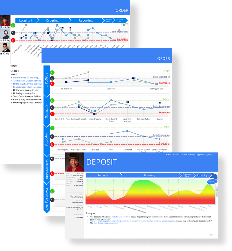
To demonstrate how users engage with the application and what happens before and after they engage with the application, I created journey maps for each of the different personas. Journey maps visually represent the user’s experience (delight and frustration) at each touch point with the product and even beyond using the application.
I created two types of journey maps for the team. One was a clickable power point file for the developers. The developers could look at a graph of the user journey for each persona and click on each touch point to reveal user feedback from our contextual interviews. This format allowed developers to look in depth at a touchpoint they are working on in that particular moment. The other journey map was intended for business owners and it was a two-page print-optimized document. This map allowed decision-makers to quickly hone in onand prioritize areas that need improvement.
Card Sorts
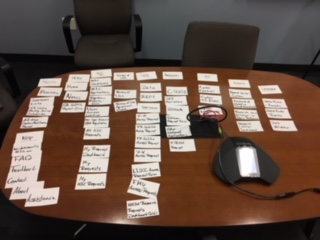
A recent project involved the redesign of a website used by researchers to request access to confidential data and applications, as well as security contacts who approve those requests. During hybrid interviews, we identified issues with the navigation. Approvers were irritated that some requests were wrongly categorized into application requests when the request was for data and vice versa. Other links did not fit into any of the categories and even the approvers who use the site on a daily basis could not identify where some of those links lead, much less users who just go there to request access once or twice.
In order to propose a new navigation, we conducted local card sorts with flash cards and remote card sorts via Skype and OptimalSort to collect data for a more intuitive information architecture. I am currently working with the designer and client to design a new navigation.
Reports
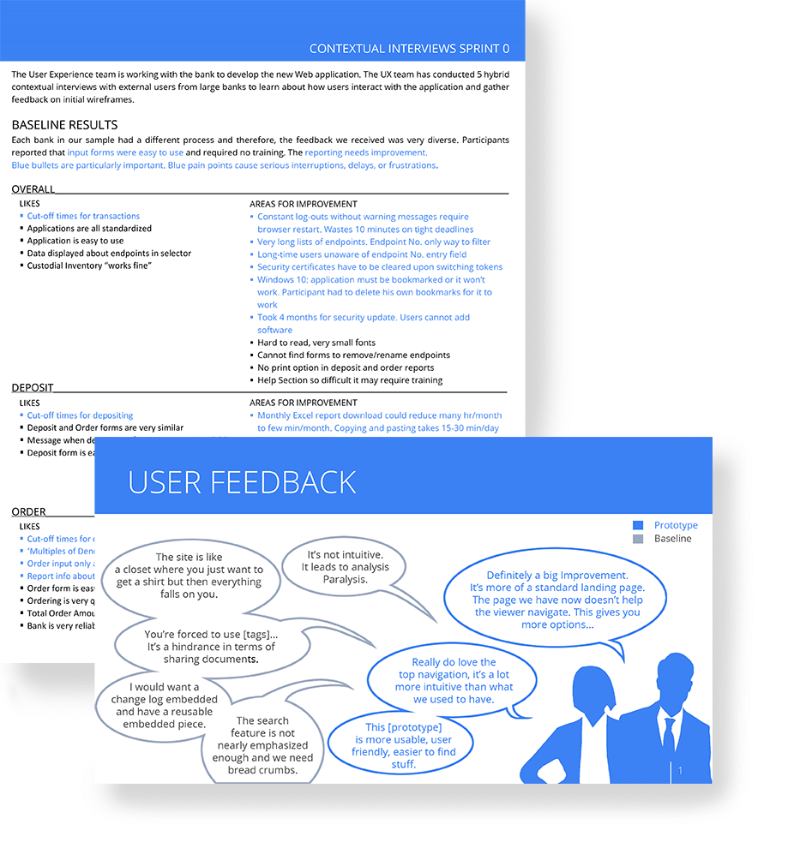
(Any identifying information about the team, the client, the banks, or the application has been removed).
UX Reports can take many shapes and forms but one thing I like to keep in mind is that developers and product owners often do not have the time to read lengthy documents. Summaries must be scannable and convey only what is important. Furthermore, the report has to fit with the team’s workflow.
One of the teams I worked with has a process of developing each tool within an application at a time. Therefore I developed a report that has a section with data about each tool and those sections are divided into “Likes” on the left and “Areas for Improvement” on the right. This template allows developers to quickly reference the report and only look at the data that is relevant to the tool they are working on in that moment.
Final Reports usually take on the form of power point slides with overall trends. Power point slides are often easier to digest than long text documents. A highlight of these reports are the user feedback slides that connect the client with actual user feedback.
Prototypes and Mock-Ups
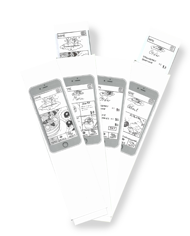
During Hybrid interviews and usability tests we show users prototypes and mock-ups of the applications and websites developers are planning to implement. For usability tests, we generally use clickable prototypes to see how users react to the functionality and whether they understand how to interact with a product. A clickable prototype is rather elaborate and would be used later in the process. However, we can also gauge user’s opinions in the initial stages of development through the use of static-image mock-ups and paper prototypes.
We hold annual UX workshops in which we introduce paper prototyping to people unfamiliar with the process. The above-featured paper iPhone prototypes are samples of a fictional dessert shop mobile website I have created for our UX workshop.
Gender Differences in Desperate Dependence
In 2013, I conducted my own social psychological research as a final project for my psychology research class in college. The research was based on the theory of desperate dependence coined by late author and psychologist Penelope Russianoff.
According to Russianoff, women construct their entire life around their male partners. In 1992, Australian researchers tested the theory on exclusively heterosexual women and found that desperate dependence was distinct from general dependence and that it was positively correlated with negative mental health outcomes such as depression and low self-esteem. I thought the exclusive sample of heterosexual women lacked a meaningful control group. How can we claim that women construct their lives around men if we do not compare them to other sexualities and genders?
Therefore, I designed a gender-neutral version of the Australian measure and decided to analyze gender differences in desperate dependence. I asked participants for their biological sex (male or female), gender (masculine, feminine, both) and their sexual preferences (man, woman, both, neither).
Before I conducted the study, I expected to recruit other students as participants for extra credit offered by some of my psychology professors. Hence, I expected a mainly American sample of college students. However, there were only 17 participants shortly before the paper was due. Therefore, I advertised the study on Facebook and recruited over 164 participants from 23 different countries (mostly European) that were highly educated. Only 128 participants were included because the rest were mainly extra credit students that submitted their results late and my professor advised me not to dilute my international sample.
My hypothesis agreed with the theory that women, particularly heterosexual women, would be more desperately dependent than heterosexual men. Contrary to my hypothesis, I did not find statistically significant results. Interestingly, the men in my study scored higher on desperate dependence than the women, even when non-traditional genders and preferences were excluded from the analysis.
These puzzling results led me to be invited for an oral presentation at the Honors Transfer Council of California Conference and a poster presentation at Stanford. My abstract for this study was published in the 2014 edition of Building Bridges.
The research experience taught me to be creative about recruiting participants, because the planned avenues sometimes do not work as intended. Additionally, I was able to be invited to conferences and published with results that neither supported my hypothesis, nor met significance. The fact that men were more desperately dependent than women in my study was interesting in itself.
I believe that men may be more desperately dependent than women because men in European and U.S. contexts are socialized to hide their emotions from others. Many men, therefore, lack a meaningful emotional support system and romantic relationships are the only avenues in which it may be socially appropriate to express emotions. This could explain why the men in my study relied so strongly on the partners in their lives.
Gender of Role Models and Constructions of Strength in the United States and India
I worked as a research assistant for Stanford SPARQ, the former Mind Culture & Society Lab over the year 2015. In one of several projects I was involved in, the head researcher was interested in cross-cultural constructions of strength and whether there is a gender bias in role models.
As a research assistant, I was supposed to code the 500 qualitative participant answers for 'gender of role model' and 'type of strength' among other items. The head researcher had intended for me to categorize strength into the following 3 categories: 'mental,' physical,' and 'mix' (of mental and physical). The open-ended question that participants had answered was: " Who is your role-model for strength and why?"
When I coded participant answers, however, many did not conform to the categories that the researcher had planned. Many participants answered simply "me" or "I." As the person responsible for coding, I was not allowed to see participant gender because that could bias my data. So, I could neither code for gender nor type of strength since there was no information about it. Some participants wrote simply the names of celebrities which I could Google but in cases like "Arnold Schwarzenegger" there were many possible types of strength such as physical strength but also political power or mental strength. The way the question was asked left room for satisficing which we as researchers should try to prevent. Some of the data became useless because of this tendency to satisfice.
Another problem we ran into was that many of the more thoughtfulanswers did not conform to the coding scheme: How could I code 'bamboo,' 'money,' or 'political power' into the categories 'physical,' 'mental,' or 'mix' (of both)? The initial coding scheme did not include the universe of answers so I talked to the head researcher and designed a completely new coding scheme based on the answers. The final coding scheme included 34 types of strength.
The experience taught me that participants are often unpredictable and that research sometimes has to be readjusted as the research is being conducted. It also taught me first hand, the importance of preventing satisficing. In a large study, some participants are guaranteed to satisfice for various reasons and it is the researchers' responsibility to minimize the impact of satisficing on the results.
Economic Study/ Tragedy of the Commons
I worked as a research assistant for the Stanford Lab for Social Research over the summer of 2015. In one of the many different studies I was involved in, the Principal Investigator was interested in how the group influences the behavior of individuals in a tragedy-of-the commons type economic game.
In this game, four participants would get $10 and have the choice to give money into a community pot in each of 12 rounds. After each round, the money in the pot would be doubled and equally distribtued back to all four participants, whether they had contributed to the pot or not.
I facilitated several sessions of this study with 16 participants (4 groups) per session. I set up the laboratory computers that the participants had access to and the researcher computer that was keeping track of the gains or losses that were made in the games. I read instructions to participants, guided them to their computers, and responded to their questions. During the study, I observed participants and tracked down anything unusual on a note-pad. I helped with technical difficulties and distributed money that the participants won.
As a research assistant, I was not briefed on the purpose of the research. However, I thought it was curious that most of the participants whom I handed money afterwards had between $14 and $20. I learned from these anecdotal results that few of the participants played the game efficiently. Ideally, the game would yield the most money to all participants if every single person added their entire fortune into the community pot in each round. However, most players chose to play safe and made only very small gains. The highest amount I paid to a participant was $26. This is in line with research that people are more risk-averse when they may potentially lose money (adding money to the community pot) than when they may potentially win money (the pay-out from the community pot).